Local NR-IQA using Convolutional Neural Networks
Teaching a CNN to judge image quality one 64x64 patch at a time.
Perceptual quality has almost always been studied as a property of a whole image. My BSc thesis asked what happens if you zoom in instead.
Error Is Not Quality
The instinctive way to measure how badly an image has been degraded is to compare it to the original and average the squared differences. Mean squared error, and the peak signal-to-noise ratio derived from it, are still everywhere in the compression literature, largely because they are simple and have a tidy relationship to signal energy.
They are also close to useless as a model of what a person sees:
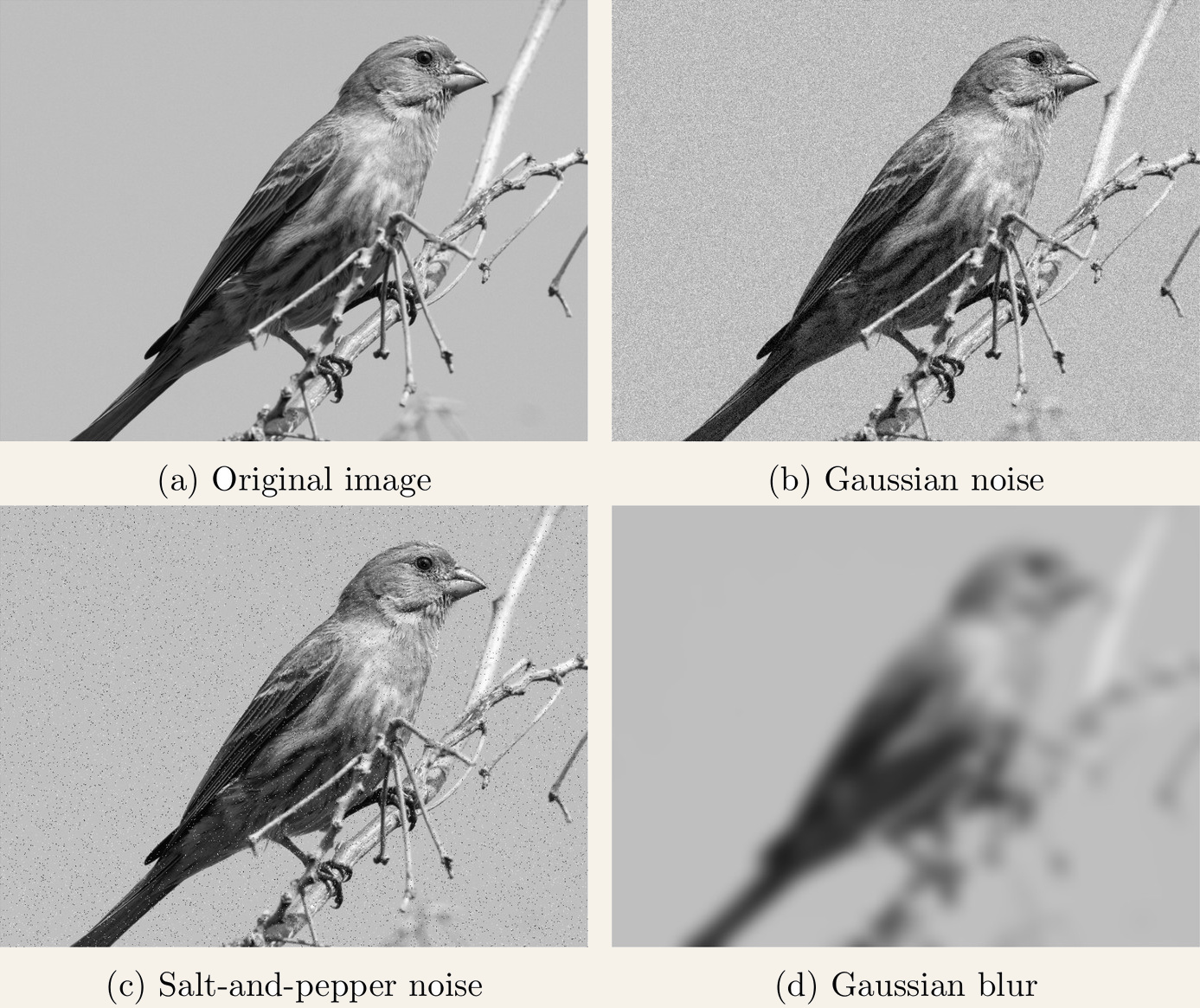
All three degraded birds sit at exactly the same distance from the original under MSE. Nobody would rank them equally. The metric is pixelwise and sign-independent, so it is blind to the structure that makes natural images legible — and, as the literature had already established, unreliable both across content and across distortion types.
Image Quality Assessment (IQA) is the field that tries to do better: predict the score a human panel would give, without convening one. The hardest and most useful flavour is no-reference IQA, where there is no pristine original to compare against — you get one image and have to judge it blind. That is the setting for anything real: photos uploaded to a platform, frames arriving over a stream, a compressor deciding how hard to squeeze.
One Number Per Image Isn’t Enough
Where I thought the field had left something on the table was locality. Essentially every method, classical or learned, collapses an image into a single scalar Mean Opinion Score — regardless of whether the photo is uniformly sharp, or a razor-focused subject sitting in a mushy out-of-focus background.
A global score cannot tell you where an image is good. Some methods operated on patches internally, but were only ever evaluated globally, and — more importantly — were trained on the assumption that an image’s global MOS is a valid label for every patch sampled from it. That assumption is obviously false for exactly the images where locality matters most.
So the thesis set out to do three things: build a dataset with genuinely local labels, train a no-reference predictor on it, and then check whether local predictions are still useful once you zoom back out to global tasks.
How Small Is a Quality Judgement?
First: what does “local” even mean? Two constraints pull against each other. A single pixel plainly carries no quality information, and small patches are hard for humans to assess at all. But a large patch starts smuggling in content — and once a rater can see what the picture is of, their judgement gets contaminated by whether they like the subject and how they think it ought to be depicted.
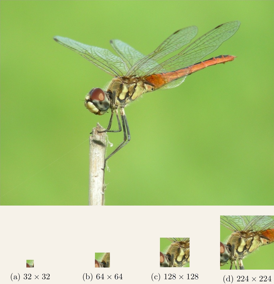
I settled on 64x64 pixels, sampled from 1024x768 images: as small as possible while still assessable, and small enough to give away few content cues. It is an ad-hoc choice and I said so in the thesis — it is not defensible against every objection, but a decision had to be made.
Building KonPatch
No dataset of locally annotated patches existed, so the first contribution had to be one. KonPatch is 32,000 individually annotated 64x64 patches: 500 source images drawn from KonIQ-10k, 64 patches sampled at random locations from each. Those 500 images were then excluded from the rest of the database, so nothing downstream is ever evaluated on an image Patchnet partly trained on.
Annotation was deliberately cheap: a binary lab judgement per patch — does this look like it came from a high-quality image, or not? One vote each. That is a compromise, and it introduces a hard decision boundary into a phenomenon that is clearly not binary.
The trick that makes it workable is that every patch inherits a source image with a known global MOS. So the label becomes a continuous score: a patch flagged as high quality takes its parent image’s MOS, and a rejected patch takes zero. A binary study, scored continuously.
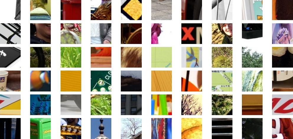
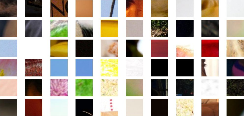
The distinction is intuitive even stripped of context: crisp edges, plausible focus and clean colour on one side; blur, noise and washed-out flat regions on the other.
Patchnet
Patchnet is a 14-layer CNN: seven convolutional layers with three maxpooling stages between them, the final feature maps vectorised into a fully connected predictor of 1024, 16, 8 and finally 1 neuron. ReLU throughout, except the output, where a sigmoid bounds the prediction to [0, 1].
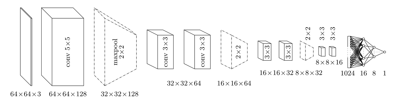
Twenty percent of KonPatch was held out for testing, and the remaining 25,600 patches split five ways for cross-validation, with a separate training run from random initialisation per fold. Implementation was Keras on TensorFlow, Adam, batch size 512, trained on Nvidia K40s.
Validation loss bottoms out and turns upward after roughly 30 epochs. Rather than adding dropout to a network this small, I used early stopping, keeping the best-performing checkpoint per fold. Those five models land within a narrow band of each other on the held-out test set: MSE between 0.059 and 0.071, SROCC between 0.649 and 0.678.
Taken at face value, an MSE of 0.06 on labels spanning [0, 1] looks poor. It isn’t quite what it seems: because of how the scores were constructed, the label distribution is two well-separated clusters — rejected patches at zero, accepted patches up near their source MOS — with very little in between. The distance between the clusters is large compared to the error, so the model is not straddling the boundary the way that number suggests. The consistency of the early-stopped models transferring cleanly to unseen test data was the more meaningful signal.
From Patches to Maps
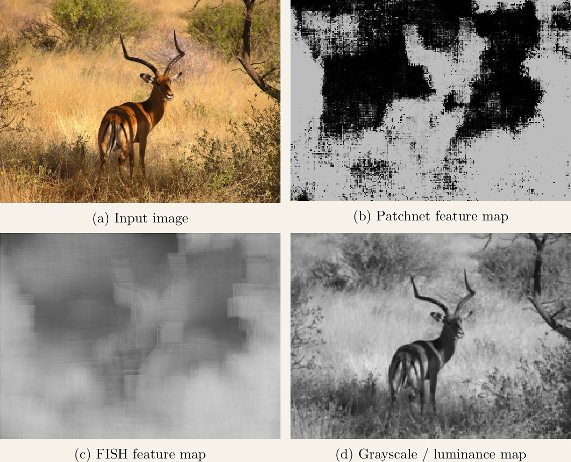
A patch scorer becomes something more interesting when you slide it. Run Patchnet across a whole image with stride δ and you get a quality map — a spatial readout of predicted quality instead of a single number.
Do the Maps Match Humans?
Eyeballing a map and declaring it good is not evidence. But since no local quality benchmark existed, I had to build the yardstick too: 125 fresh images from KonIQ-10k, 30 participants each, asked to draw bounding boxes tightly around regions they considered high quality — or tick a box saying the image contained none.
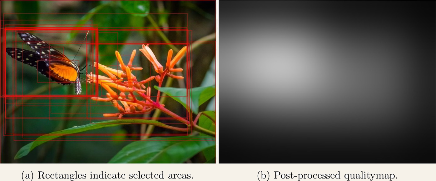
Each pixel’s score is simply the fraction of participants whose boxes covered it, with repeat boxes from the same person counted once so overlapping selections cannot manufacture peaks. Because it is normalised by the number of participants rather than within the image, the resulting map expresses absolute quality, not just relative differences — an image where nobody found anything good stays dark everywhere. Rectangles are a crude segmentation primitive, so the raw maps get a Gaussian smoothing pass with σ at 10% of the image width.
Scoring predictions against this is not a straightforward MSE, since the two datasets are labelled differently. Instead I binarised the ground truth at a threshold, swept the prediction threshold, and measured the area under the resulting ROC curve — repeated across the whole range of ground truth thresholds. Median AUC sits around 0.9, with the lower quartile around 0.8 across the entire threshold range. There are genuine failures in the tail — individual images where the model does worse than chance — but the central tendency is clear: Patchnet’s local predictions track where people actually see quality.
Zooming Back Out
If local scores are meaningful, they should also say something about global quality. I ran the sliding window at stride 4 across the 9,500 KonIQ-10k images that KonPatch never touched, producing maps at about 5.5% of input resolution.
The crudest possible aggregation — take the mean of the map — already reaches SROCC 0.667 on KonIQ-10k, against 0.560 for FISH, the wavelet sharpness metric applied the same way. Neither is a strong correlation, which is expected when you flatten a whole map to its average, but the ordering is informative.
Doing it properly meant training a second model on the maps: a headless DenseNet-169 fed three stacked spatially-small inputs — the Patchnet map, a FISH sharpness map, and a downscaled grayscale image — with the classification head replaced by a 1x1 convolution and global maxpooling, so the model accepts any input resolution. With rotation and flip augmentation the 5,700 training images became 64,400 feature maps at 82 distinct resolutions.
That meta-model reaches SROCC 0.79 / PLCC 0.81 on KonIQ-10k, comfortably ahead of the classical no-reference metrics of the day — BRISQUE at 0.70/0.70, SSEQ at 0.59/0.61, BIQI at 0.54/0.61 — and ahead of the earlier patch-based CNNs, KangCNN (0.63/0.67) and BosICIP (0.65/0.67).
It does not, however, catch DeepBIQ (0.90/0.92) or DeepRN (0.92/0.95). That gap is the most interesting result in the thesis, because it falls along a clean line. Everything below it, mine included, builds a global score by aggregating predictions over spatially small regions. Everything above it sees large regions or the entire image at once, transfer-learned from ImageNet classification models. The obvious reading: perceptual quality is a mixture of local, technical properties — sharpness, noise, compression artefacts — and global, content-dependent ones to do with composition and aesthetics. No patch, however cleverly chosen, can see the second kind. Deliberately throwing away the big picture costs you exactly the part of the judgement that depends on it.
Application: Letting Quality Maps Steer JPEG
The last chapter puts the maps to work. My group had previously built a variable-quality JPEG coder that adjusts quantization per 8x8 block according to a saliency map — with the significant catch that the saliency maps came from eye-tracking or crowd studies, one per image. That does not scale.
The idea here was to substitute Patchnet’s quality maps for those human-generated saliency maps, on the hypothesis that high-quality regions and salient regions largely coincide: in a well-shot photo, the subject is in focus and the background is not.
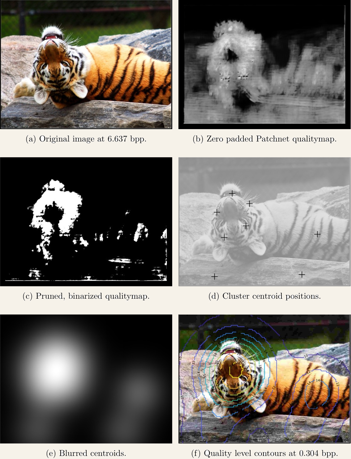
The clustering step is not cosmetic. Storing a per-block quality map inside the file would eat the bit budget it is supposed to save, so the map is pruned to its strongest 10%, reduced to eight k-means centroids, and reconstructed at decode time by blurring those centroids back out — meaning the file carries eight coordinate pairs rather than a full map.
To find out whether it actually helps, I ran another crowd study on the same 125 images. For each source, a binary search over the global quality parameter produced 100 compressed versions with evenly spaced bitrates, and participants dragged a slider to degrade a test image beside the unmodified reference until they first noticed a difference — the just noticeable difference, 15 votes per image, with a standard JPEG run as the control.
It was a wash. No consistent bitrate win emerged, and at very low bitrates VarJPEG was systematically worse — the fixed centroid overhead is a larger share of a smaller file. There was no clear trend against overhead share, source bitrate, or MOS either.
The likely explanation is a good lesson about evaluation design. VarJPEG deliberately starves the background, so at equal average bitrate it puts more artefacts there than plain JPEG does. The interface then made that worse: dragging the slider makes the first distortions appear as a flicker, and they appear precisely in the regions the algorithm sacrificed. Participants were reporting distortions honestly — the task just pointed their attention at the background, which is exactly where the method trades quality away. The measurement was aimed at the wrong part of the frame.
Looking Back
The core claim held up. Quality is meaningfully local, a CNN can learn it from small patches with genuinely local labels, and those local predictions carry real information even when the eventual task is a global score. The parts that did not pan out were the more instructive ones: the gap to whole-image models pointing at what patches structurally cannot see, and the VarJPEG study showing how easily a subjective experiment can measure the wrong thing.
The full thesis — architectures, training curves and the complete correlation tables — is available as a PDF. Parts of this work were published at QoMEX 2018 as Disregarding the Big Picture: Towards Local Image Quality Assessment.